Storms in paris paint
In the realm of interior design and home décor, paint colors play a pivotal role in setting the tone and atmosphere of a space. One shade that has captured the attention of design enthusiasts and homeowners alike is Storms in Paris paint, a captivating dark green hue reminiscent of the brooding skies over the romantic city.
This color, which pays homage to the historic Paris Green pigment from the early 19th century, has surged in popularity in recent years due to its versatility, drama-inducing qualities, and its ability to create an air of sophistication. In this article, we delve into the allure of Storms in Paris paint, exploring its characteristics, applications, and the reasons behind its widespread appeal.
What is Storms in Paris Paint?
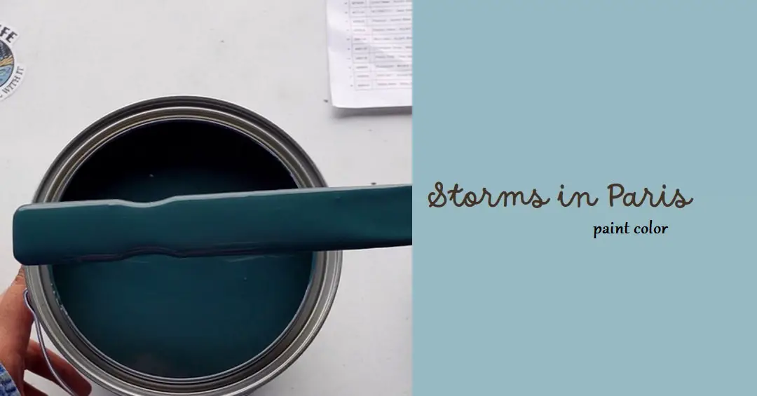
Storms in Paris paint is a deeply captivating dark green shade with intriguing hints of black, evoking the sensation of tempestuous weather brewing over the city of lights. Its name pays homage to the historic Paris Green pigment that was favored by artists and decorators in the 1800s.
This modern interpretation of the classic hue adds a contemporary touch to interiors while still retaining the aura of elegance and mystery associated with its historical counterpart.
The Color’s Characteristics
One of the defining characteristics of Storms in Paris paint is its versatility. This rich color is suitable for a myriad of settings, making it an excellent choice for various rooms within a home. From tranquil bedrooms to bustling living rooms, from quiet hallways to functional offices, and even stylish kitchens, Storms in Paris adapts seamlessly to different environments. Its innate ability to blend harmoniously with a diverse range of colors makes it a flexible option for both subtle and striking design schemes.
Specification color
- Color: Deep green with blueish undertones, evoking the moody atmosphere of a Parisian storm.
Designer: Tony Piloseno, the creative mind behind this unique shade. - Quality: Premium quality for washability, durability, coverage, and hide, ensuring a long-lasting and beautiful finish.
- Sustainability: Low VOC content, making it a more eco-friendly choice for your home.
- Coverage: Provides excellent coverage, with 350-400 square feet per gallon and 87.5-100 square feet per quart.
- Samples: Convenient Peel & Stick samples coated with actual Tonester Paint, allowing you to test the color accuracy and visualize it in your space before committing.
Overall, it seems like “Storms in Paris” is a well-rounded paint option that offers both stunning aesthetics and practical benefits. If you’re considering this color for your home, the detailed information you provided suggests you’ve done your research and are well on your way to making an informed decision.
Why Storms in Paris is a Popular Paint Color
The rising popularity of Storms in Paris paint can be attributed to its multifaceted nature. This shade transcends trends, offering a timeless allure that suits a spectrum of design preferences. Its mysterious and dramatic undertones bring a unique sense of character to any room, transforming ordinary spaces into extraordinary realms.
Storms in Paris paint also possesses the remarkable ability to invoke a feeling of opulence and sophistication, elevating interior aesthetics with its bold presence.
How to Use Storms in Paris Paint
In the Garage
The garage is often overlooked when it comes to interior design, but using Storms in Paris paint can transform this utilitarian space into a visually captivating area. By applying this dark green shade to garage walls or cabinetry, you can create a sense of intrigue and purpose. Coupled with adequate lighting, Storms in Paris paint can turn your garage into a functional yet stylish extension of your home.
In Bedrooms
Bedrooms are sanctuaries of relaxation and personal expression. Storms in Paris paint can be employed to craft an intimate ambiance, especially in larger bedrooms with abundant natural light. Pairing this dark green hue with neutral furnishings and bedding can create a sophisticated retreat that exudes elegance and tranquility.
In Living Rooms
The living room is a central hub for social interaction, and Storms in Paris paint can enhance this communal space. When used strategically on an accent wall or even as the primary color, it can set the stage for lively conversations or cozy evenings. By incorporating plush textures and contrasting décor elements, the living room becomes a haven of comfort and style.
In Other Rooms
Storms in Paris paint is not confined to specific rooms; it thrives in various spaces. Whether adorning the hallway with an air of intrigue, infusing creativity into an office setting, or adding an unexpected touch to a kitchen, this color fosters an environment that stands out while maintaining a sense of unity.
Color Psychology: Creating Ambiance and Mood
The choice of paint color can significantly influence the ambiance and mood of a space. “Storms in Paris” paint color, with its elegant gray tone, possesses a unique ability to evoke various emotions. This sophisticated shade creates a serene and calming atmosphere, ideal for those seeking respite from the chaos of everyday life.
Its cool undertones instill a sense of tranquility and introspection, allowing individuals to unwind and find solace within their surroundings. Whether used in bedrooms, living rooms, or even garages, the “Storms in Paris” paint colors set the stage for a harmonious and peaceful environment.
When it comes to the “Storms in Paris” paint color, let’s delve into its characteristics to understand its color family, light reflectance value (LRV), RGB colors, and hex code, as well as its undertones.
Color Family: The “Storms in Paris” paint color belongs to the gray color family. Gray is a versatile and neutral color that can range from cool to warm undertones.
Light Reflectance Value (LRV): The LRV represents the percentage of light that a color reflects. It is measured on a scale from 0 to 100, with 0 being completely black and 100 being pure white.
The LRV of the “Storms in Paris” paint color typically falls in the middle range, around 40 to 50. This means it has a moderate light reflectance, providing a balanced level of brightness in a space.
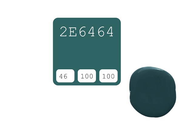
RGB Colors and Hex Code: The RGB (Red, Green, Blue) values and hex code are used to define the specific color of “Storms in Paris” for digital applications and color matching. While the exact RGB values and hex code can vary depending on the brand, an example could be:
- RGB: 18.04%, 39.22%, 39.22%
- Hex Code: #2e6464
These values represent a muted gray with cool undertones, reminiscent of the stormy skies in Paris.
Read Also:
The “Storms in Paris” paint color typically has cool undertones. Cool undertones in gray colors often have hints of blue or green, which contribute to the calming and serene atmosphere they create in a space. The cool undertones of “Storms in Paris” help evoke a sense of elegance and sophistication, making it a popular choice in interior design.
It’s worth noting that different paint brands may offer variations of the “Storms in Paris” color, each with its own specific attributes. When selecting paint, it’s always recommended to obtain color swatches or samples from your chosen brand to ensure the desired shade and undertones align with your vision for your space.
Please keep in mind that the specific values and undertones of the “Storms in Paris” paint color may vary between brands. It’s important to refer to the color documentation provided by the manufacturer you choose to ensure accuracy in achieving the desired look.
Design Trends: Embracing Dark and Moody Colors
In the realm of interior design, dark and moody colors have taken center stage in recent years. Design trends have shifted towards embracing the drama and depth these colors bring to a space. The “Storms in Paris” paint color perfectly aligns with this movement, adding an air of sophistication and intrigue to any room.
Paired with rich textures, such as velvet or faux fur, this shade creates a luxurious atmosphere that exudes comfort and style. As an accent wall or as the primary color in a room, “Storms in Paris” makes a bold statement while maintaining a timeless elegance.
Historical and Cultural Significance: Capturing Parisian Charm
Paris, the City of Lights, has captivated people’s hearts for centuries with its romantic charm and artistic heritage. The storms in Paris’s paint color pay homage to this iconic city, evoking its timeless elegance and sophistication.
Reminiscent of rainy days spent wandering the historic streets of Paris, this shade imbues spaces with a sense of mystery and intrigue. Just as the storms in Paris bring momentary darkness before the sun emerges, the “Storms in Paris” paint color adds depth and character to interiors, inviting occupants to immerse themselves in the city’s cultural tapestry.
Whether used in a Parisian-inspired design scheme or as a subtle nod to the city’s allure, this color choice creates a connection to the rich history and artistic legacy of Paris.
Tips for Incorporating the Color: Creating a Cohesive Space
Incorporating the “Storms in Paris” paint color into your interior design requires careful consideration to create a cohesive and visually appealing space. Here are some tips to guide you:
- Complementary Color Palettes: Pair the “Storms in Paris” paint color with complementary shades to enhance its elegance and sophistication. Soft neutrals like creamy whites, warm taupes, or light blush tones create a harmonious balance, allowing the gray hue to shine.
- Contrasting Accents: Introduce pops of color to contrast with the muted gray tone. Vibrant jewel tones like emerald green or deep sapphire blue add an element of drama and create visual interest in the space.
- Texture and Materials: Incorporate different textures and materials to add depth and tactile appeal. Plush velvet, smooth marble, and natural wood create a dynamic interplay of surfaces, enhancing the overall aesthetic.
- Lighting Techniques: Consider the lighting in your space to maximize the impact of the “Storms in Paris” paint color. Soft, warm lighting creates a cozy atmosphere, while bright and natural light highlights the undertones and brings out the nuances of the gray shade.
- Furniture and Accessories: Choose furniture and accessories that complement the elegance of the “Storms in Paris” paint color. Luxurious fabrics, such as velvet or silk, and ornate detailing add a touch of opulence, while sleek and minimalist designs create a contemporary vibe.
By following these tips, you can seamlessly incorporate the “Storms in Paris” paint color into your interior design, creating a cohesive and visually striking space that reflects your personal style.
Read Also: garage paint ideas
Storms in Paris Paint Color by Tonester
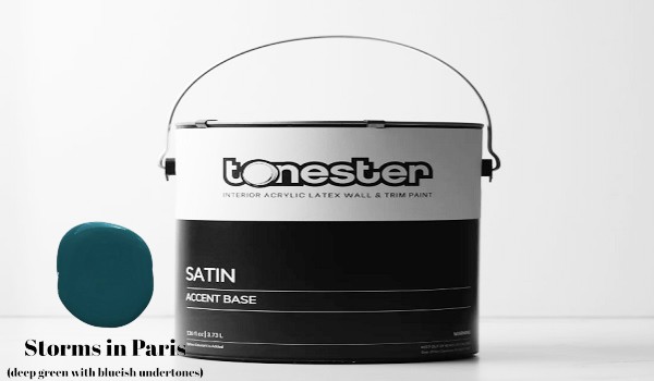
Tonester Paints is a renowned UK brand known for its commitment to quality and innovation in the world of interior paints. Among their extensive palette of hues, “Storms in Paris” stands out as one of their most popular and coveted shades.
A Dark and Smoky Gray Paint Color
“Storms in Paris” is a shade of gray like no other. It embodies the essence of a stormy evening in the City of Light. Its deep, smoky undertones evoke an air of mystery and sophistication, making it an ideal choice for those who appreciate the finer details of interior design.
A Hint of Blue
What sets “Storms in Paris” apart from your typical dark gray paint is its subtle hint of blue. This touch of blue-gray undertone adds depth and complexity to the color, giving it an intriguing allure that is hard to resist. It’s this unique blend of colors that makes it an exceptional choice for various design styles.
Versatility in Interior Design
“Storms in Paris” is a versatile paint color that can be employed in a multitude of design settings. Its cool gray undertones make it a flexible choice that can adapt to different styles and moods.
Creating Drama and Sophistication
One of the most common uses of “Storms in Paris” is to create a dramatic and sophisticated ambiance. When applied to an accent wall or used as the primary color in a room, it instantly transforms the space. The deep, smoky hues draw attention and create a sense of mystery, making it an excellent choice for bedrooms and living areas where you want to make a statement.
Pairing with Other Colors
The versatility of “Storms in Paris” extends to its compatibility with other colors. Whether you want to create a monochromatic scheme by pairing it with lighter shades of gray, or you prefer to add pops of color through furnishings and decor, this paint color serves as a perfect canvas for your creativity.
Suitable for Various Design Styles
“Storms in Paris” transcends design boundaries. It can seamlessly fit into modern, traditional, or eclectic interiors. Its timeless appeal means that you won’t need to repaint when you decide to update your decor, making it a practical choice for those who appreciate long-lasting style.
Conclusion
In the realm of interior design, Storms in Paris paint emerges as a compelling choice for those seeking to imbue their spaces with depth, drama, and sophistication. Its origins in the historic Paris Green pigment lend it a sense of nostalgia, while its modern interpretation breathes new life into interiors.
Whether gracing the walls of a bedroom, commanding attention in a living room, or adding an unexpected twist to a hallway, Storms in Paris paint leaves an indelible mark, reminding us that the interplay of color and design is a powerful tool for crafting captivating environments.


Storms in Paris is not made by Sherwin Williams. It is a paint from tonester a UK brand.
Thanks for the correction! I apologize for any confusion this may cause. I’m still in development, and I appreciate your input in helping me learn and improve.