Color of the Year 2024
In the world of interior design and home decor, the Color of the Year is an annual event that sets the tone for the coming year’s trends.
It’s a momentous occasion eagerly anticipated by design enthusiasts, homeowners, and industry professionals alike.
The Color of the Year is more than just a hue; it’s a reflection of our cultural and aesthetic values, a manifestation of our collective desires and aspirations.
In this article, I will explore what the Color of the Year is, how paint companies select it, and most importantly, the Color of the Year for 2024 from major paint companies.
I also discuss how to use these captivating colors to transform your home into a stylish and inviting space.
What is a Color of the Year?
A Color of the Year is a specific color chosen by various influential organizations and companies in the design and home decor industry to represent the prevailing trends, emotions, and aspirations of a given year.
It serves as a symbolic representation of what’s in vogue, making it an indispensable tool for designers, decorators, and homeowners.
The Color of the Year reflects the current socio-cultural climate and often carries a message or meaning. It can evoke emotions, inspire creativity, and set the tone for design choices in various fields, from fashion to interior design.
This chosen color often acts as a focal point for design schemes, influencing everything from wall colors to furniture and accent pieces.
How Do Paint Companies Choose Their Colors of the Year?
Selecting the Color of the Year is a meticulous process that involves a deep understanding of trends, extensive research, and a keen awareness of the cultural zeitgeist.
The chosen color must resonate with people on a fundamental level. Paint companies typically consider several key factors when making their selection:
- Trend Analysis: Paint companies employ teams of experts who closely monitor global and local trends in various industries, including fashion, art, and design.
- Cultural Relevance: The chosen color should reflect the values, moods, and aspirations of the current cultural climate.
- Consumer Feedback: Companies often seek input from consumers and design professionals to gauge the preferences of their target audience.
- Sustainability: In recent years, sustainability and eco-friendliness have become significant factors in color selection.
- Innovation: Companies look for colors that inspire creativity and innovation.
What Are the Trends in Colors of the Year for 2024?
As we enter 2024, the colors of the year are a captivating blend of soothing and invigorating shades, reflecting our collective desire for balance, creativity, and rejuvenation.
The color selections for 2024 reveal a universal call for tranquility, optimism, and a renewed sense of purpose.
The 2024 Color of the Year from Each Major Paint Company
Let’s take a closer look at the 2024 Colors of the Year from some of the leading paint companies:
Benjamin Moore: Blue Nova 825
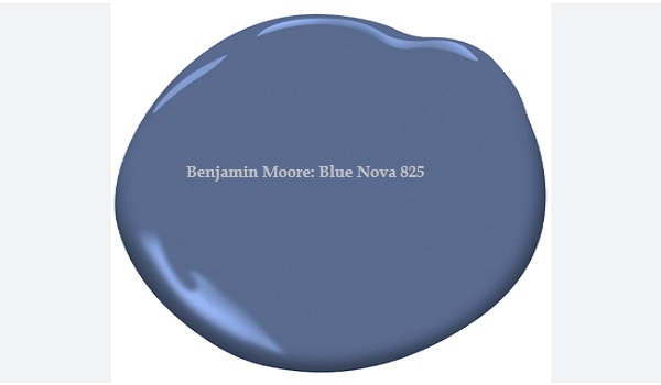
Benjamin Moore’s Color of the Year 2024 is Blue Nova 825, a saturated, vibrant blend of blue and violet. This color is inspired by the brilliance of a new star formed in space. It is a bold and versatile color that can be used in a variety of ways in your home.
Blue Nova 825 is a great choice for an accent wall, front door, or kitchen island. It can also be used to create a calming and inviting space in your bedroom or living room.
To pair Blue Nova 825 with other colors, consider using white, cream, or gray for a classic look. You can also pair it with other bold colors like yellow, orange, or green for a more eclectic look.
Sherwin-Williams: Upward
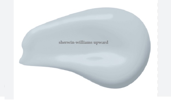
Sherwin-Williams Color of the Year 2024 is Upward (SW 6239), a light, airy blue with gray undertones. This color is inspired by the feeling of optimism and hope for the future. It is a calming and versatile color that can be used in a variety of ways in your home.
Upward is a great choice for walls, ceilings, and trim. It can also be used to create a focal point in a room by painting a single accent wall or piece of furniture.
To pair Upward with other colors, consider using white, gray, or beige for a classic look. You can also pair it with other blue hues for a more monochromatic look.
HGTV Home by Sherwin-Williams: Persimmon
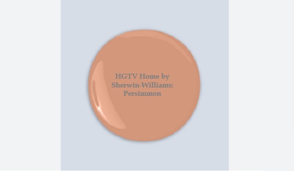
HGTV Home by Sherwin-Williams’ Color of the Year 2024 is Persimmon (HGSW6339), a warm, earthy orange with pink undertones. This color is inspired by the vibrant hue of the persimmon fruit. It is a bold and versatile color that can be used in a variety of ways in your home.
Persimmon is a great choice for an accent wall, front door, or kitchen island. It can also be used to create a warm and inviting space in your living room or bedroom.
To pair Persimmon with other colors, consider using white, cream, or gray for a classic look. You can also pair it with other bold colors like yellow, green, or blue for a more eclectic look.
Dutch Boy: Ironside
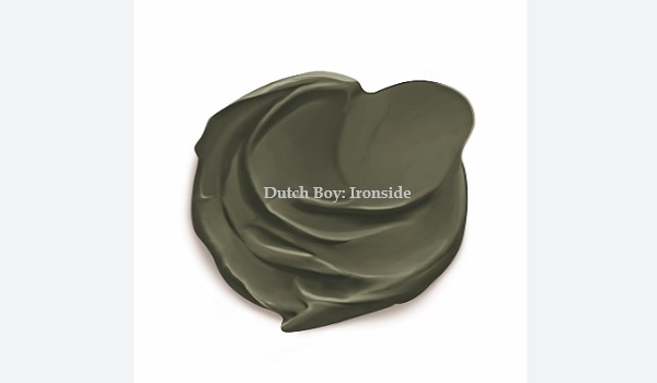
Dutch Boy’s Color of the Year 2024 is Ironside, a deep olive green with gray undertones. This color is inspired by the strength and resilience of iron. It is a bold and versatile color that can be used in a variety of ways in your home.
Ironside is a great choice for an accent wall, front door, or kitchen island. It can also be used to create a calming and luxurious space in your bedroom or living room.
To pair Ironside with other colors, consider using white, cream, or gray for a classic look. You can also pair it with other bold colors like yellow, orange, or blue for a more eclectic look.
Behr: Cracked Pepper
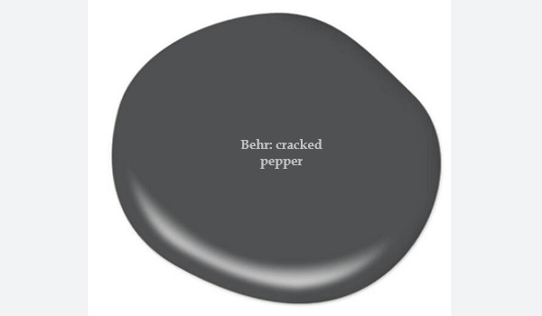
Behr’s Color of the Year 2024 is Cracked Pepper (PPU18-01), a soft, warm black with gray undertones. This color is inspired by the rich hues of cracked peppercorns. It is a versatile and sophisticated color that can be used in a variety of ways in your home.
Cracked Pepper is a great choice for walls, ceilings, and trim. It can also be used to create a focal point in a room by painting a single accent wall or piece of furniture.
To pair Cracked Pepper with other colors, consider using white, cream, or gray for a classic look. You can also pair it with other bold colors like yellow, orange, or green for a more eclectic look.
Valspar: Renew Blue
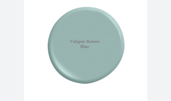
Valspar’s Color of the Year 2024 is Renew Blue (8003-37D), a soft, calming blue with green undertones. This color is inspired by the beauty of the natural world and the feeling of renewal and hope. It is a versatile and sophisticated color that can be used in a variety of ways in your home.
Renew Blue is a great choice for walls, ceilings, and trim. It can also be used to create a focal point in a room by painting a single accent wall or piece of furniture.
To pair Renew Blue with other colors, consider using white, cream, or gray for a classic look. You can also pair it with other blue hues for a more monochromatic look.
Glidden: Limitless
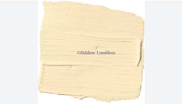
Glidden’s Color of the Year 2024 is Limitless (PPG1091-3), a warm, versatile hue that combines the power of a primary color with the essence of a neutral. It is a soft honey beige with yellow undertones that can be used to create a variety of looks in your home, from classic to modern.
Limitless is a great choice for walls, ceilings, and trim. It can also be used to create a focal point in a room by painting a single accent wall or piece of furniture.
To pair Limitless with other colors, consider using white, cream, or gray for a classic look. You can also pair it with other bold colors like yellow, orange, or green for a more eclectic look.
C2 Paint: Thermal
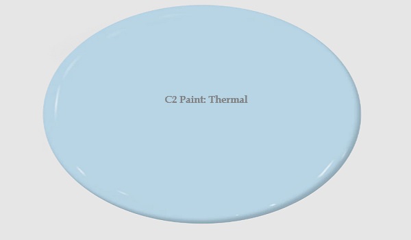
C2 Paint’s Color of the Year 2024 is Thermal (#752), a fluid, refreshing blue that is both invigorating and calming. It is a bespoke pale yet punchy blue that is poised for adventure and brimming with hope, evoking feelings of loyalty, trust, and confidence. Its contradictory nature has the dual ability to uplift us and provide a sense of calm and tranquility.
Thermal is a great choice for walls, ceilings, and trim. It can also be used to create a focal point in a room by painting a single accent wall or piece of furniture.
To pair Thermal with other colors, consider using white, cream, or gray for a classic look. You can also pair it with other blue hues for a more monochromatic look.
Minwax: Bay Blue
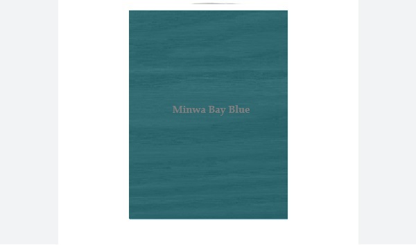
Minwax’s Color of the Year 2024 is Bay Blue (MW1049), a soothing blend of blue and green that evokes the tranquil beauty of nature. It is a versatile color that can be used to create a variety of looks in your home, from classic to modern.
Bay Blue is a great choice for staining wood floors, cabinets, furniture, and other surfaces. It can also be used to create a focal point in a room by staining a single wall or piece of furniture.
To pair Bay Blue with other colors, consider using white, cream, or gray for a classic look. You can also pair it with other blue hues for a more monochromatic look.
Krylon: Bluebird
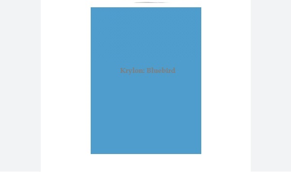
Krylon’s Color of the Year 2024 is Bluebird (K02941007), a bright and cheerful blue hue that is both calming and invigorating. It is a versatile color that can be used to create a variety of looks in your home, from classic to modern.
Bluebird is a great choice for spray painting furniture, walls, accents, and other surfaces. It can also be used to create a focal point in a room by spray painting a single wall or piece of furniture.
To pair Bluebird with other colors, consider using white, cream, or gray for a classic look. You can also pair it with other blue hues for a more monochromatic look.
Dunn-Edwards: Skipping Stones

Dunn-Edwards’ Color of the Year 2024 is Skipping Stones (DET567), a serene and steely blue with hints of green and gray. It is a meditative and energizing color that is inspired by the sea. As we move into 2024, Skipping Stones lets you capture the feeling of dreamy nostalgia blended with a future of unlimited possibilities.
Skipping Stones is a versatile color that can be used in a variety of ways in your home. It can be used to create a calming and relaxing space, or a more bold and energetic space. It can also be used to add a touch of sophistication and elegance to any room.
How to Use the Color of the Year in Your Home
Incorporating the Color of the Year into your home is an exciting endeavor, and the possibilities are endless. Here are some tips on how to make the most of these captivating hues:
Choosing the Right Shade
The key to using the Color of the Year effectively is to select the right shade for your space. Consider the lighting, the size of the room, and the existing decor. You can use the Color of the Year as the dominant color or as an accent.
Pairing Colors
Don’t be afraid to experiment with color combinations. The Colors of the Year for 2024 pair beautifully with a range of complementary hues. Blue Nova pairs well with soft neutrals, while Persimmon adds vibrancy when combined with earthy tones.
Using Color in Different Rooms
Different rooms serve different purposes, and the Color of the Year can adapt to each one. Use soothing blues and greens in the bedroom for a calming atmosphere, or invigorating shades in the kitchen or living room for a burst of energy.
Popular Color Combinations for 2024
Here are some specific color combinations that are popular for 2024:
- Navy blue and sage green: This combination is both calming and sophisticated. It can be used to create a variety of looks, from traditional to modern.
- Emerald green and burgundy: This combination is bold and luxurious. It is perfect for creating a statement wall or focal point in a room.
- Terracotta and mustard yellow: This combination is warm and inviting. It is perfect for creating a cozy and inviting space.
- White and navy blue: This classic combination is always in style. It is perfect for creating a crisp and clean look in any room.
- Light gray and blush pink: This combination is soft and romantic. It is perfect for creating a calming and relaxing space.
No matter what your style is, there is a color combination that is perfect for you in 2024. So don’t be afraid to experiment with different colors and find the perfect combination to create the home of your dreams.
Alternatives to the 2024 Colors of the Year
If the Colors of the Year don’t quite match your personal style, don’t worry. There are numerous alternatives available.
Explore different color palettes and choose the ones that resonate with you and your space. Your home should reflect your personality and taste.
Here are some alternatives to the 2024 Colors of the Year:
Instead of Benjamin Moore Blue Nova:
- Indigo
- Prussian blue
- Ultramarine blue
- Cobalt blue
- Navy blue
Instead of Sherwin-Williams Upward:
- Sky blue
- Powder blue
- Periwinkle
- Turquoise
- Aquamarine
Instead of HGTV Home by Sherwin-Williams Persimmon:
- Burnt orange
- Terracotta
- Rust
- Sienna
- Amber
Instead of Dutch Boy Ironside:
- Olive green
- Hunter green
- Moss green
- Forest green
Instead of Behr Cracked Pepper:
- Charcoal gray
- raphite
- Anthracite
- Slate gray
- Black
Instead of Valspar Renew Blue:
- Soft blue
- Baby blue
- Denim blue
- Teal
- Navy blue
Instead of Glidden Limitless:
- Cream
- Ivory
- Beige
- Taupe
- Sand
Instead of C2 Paint Thermal:
- Sky blue
- Turquoise
- Aquamarine
- Mint green
- Seafoam green
Instead of Minwax Bay Blue:
- Teal
- Indigo
- Navy blue
- Emerald green
- Hunter green
Instead of Krylon Bluebird:
- Robin’s egg blue
- Powder blue
- Periwinkle
- Turquoise
- Aquamarine
Expert Advice on Choosing and Using Color in Your Home
In conclusion, the Color of the Year is not just about following trends; it’s about expressing your style and creating a home that inspires you every day.
Incorporating the 2024 Colors of the Year into your living space is an opportunity to set the mood, create a harmonious atmosphere, and stay in touch with the ever-evolving world of design and color.
When choosing and using the Color of the Year, remember to trust your instincts. Your home is a reflection of your personality and should be a place where you feel comfortable and inspired.
So, whether you embrace Blue Nova, Upward, Persimmon, or any other color that speaks to you, make it your own, and let it illuminate your life throughout 2024 and beyond.
Embrace the Color of the Year 2024 and let it be your guide in transforming your home into a place of beauty and harmony.

