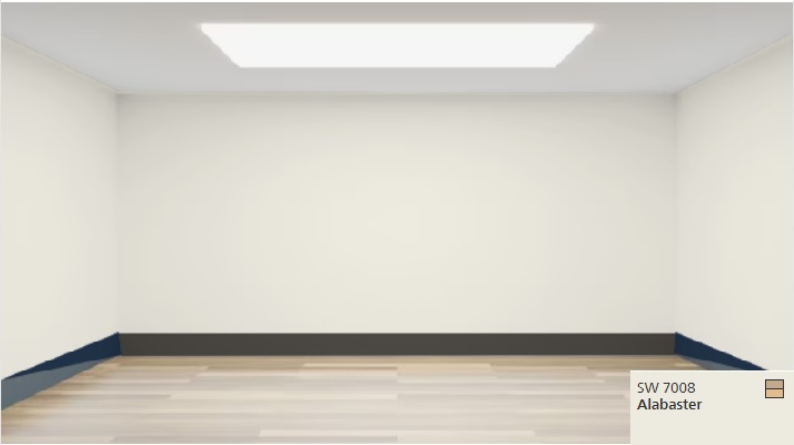
Alabaster Color Sherwin Williams
If you’re looking for a timeless, elegant paint shade for your garage that’s both versatile and sophisticated, look no further than the alabaster color Sherwin Williams.
Named the Sherwin-Williams 2016 Color of the Year, this warm, neutral shade has taken the design world by storm and continues to be a popular choice for homeowners and designers alike.
Let’s take a closer look at the color of Alabaster, its coordinating colors, and how to use it in your home.
We’ll also explore the psychology behind color selection and how to use color to achieve your desired mood and atmosphere in your living space.
What color is Sherwin Williams Alabaster?
Alabaster is a warm, creamy white with subtle undertones of beige and gray. It’s a versatile neutral that pairs well with a variety of color schemes and design styles.
This paint color is often described as having a calming and serene effect, making it a popular choice for bedrooms, garages, and other spaces where relaxation is a top priority.
Read also: Is Sherwin Williams Paint Worth It?
Sherwin Williams Alabaster 7008
If you’re looking for a versatile and timeless paint color for your home, Sherwin Williams Alabaster 7008 is an excellent choice.
This shade has gained popularity in recent years, thanks to its ability to pair well with a variety of design styles and coordinating colors.
Color Family
Sherwin Williams Alabaster 7008 belongs to the white color family, but it’s not pure white. Instead, it has subtle undertones of beige and gray that give it a warm and welcoming feel.
Read Also: garage paint colors
Light Reflectance Value
The Light Reflectance Value (LRV) of Sherwin Williams Alabaster 7008 is 82, which means it reflects a high amount of light. This makes it an excellent choice for smaller or darker rooms that need to feel brighter and more open.
RGB Colors
The RGB colors of Sherwin Williams Alabaster 7008 are:
Red: 238
Green: 233
Blue: 221
These colors work together to create a soft and inviting hue that can add warmth to any space.
Hex Code
The hex code for Sherwin Williams Alabaster 7008 is #EEE9DD. This code is used in digital design and can help you match the color precisely across different platforms.
Undertones
As mentioned earlier, Sherwin Williams Alabaster 7008 has subtle undertones of beige and gray. These undertones make it a versatile shade that can pair well with a variety of coordinating colors and design styles.
Read Also: Why is Sherwin Williams Paint So Expensive?
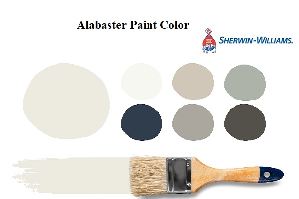
Coordinating Colors for Sherwin Williams Alabaster
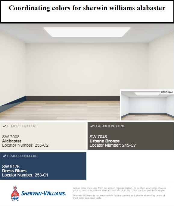
When selecting coordinating colors for Sherwin Williams Alabaster, it’s essential to consider the undertones of the paint shade. This can help you create a cohesive and harmonious look throughout your living space.
Gray Coordinating Colors
Sherwin Williams Alabaster pairs well with shades of gray, making it an excellent choice for those who want a neutral color scheme with a touch of warmth. Some popular gray coordinating colors for Alabaster include:
- Repose Gray (SW 7015)
- Mindful Gray (SW 7016)
- Agreeable Gray (SW 7029)
- Dorian Gray (SW 7017)
Blue Coordinating Colors
Sherwin Williams Alabaster can also pair well with shades of blue, creating a calm and serene atmosphere in your living space. Some popular blue coordinating colors for Alabaster include:
- Tradewind (SW 6218)
- Sea Salt (SW 6204)
- Rain (SW 6219)
- Light French Gray (SW 0055)
Pink Coordinating Colors
For those who want to add a touch of femininity to their living space, Sherwin Williams Alabaster can pair well with shades of pink. Some popular pink coordinating colors for Alabaster include:
- Malted Milk (SW 6057)
- Blushing (SW 6617)
- Rose Embroidery (SW 6292)
- Intimate White (SW 6322)
Alabaster Paint Color: Coordinating Colors
One of the benefits of using Alabaster color in your home is its versatility when it comes to coordinating colors. Here are some of the most popular colors to pair with Alabaster:
1. Gray
Alabaster pairs beautifully with shades of gray, creating a timeless and sophisticated look. Lighter shades of gray, such as Repose Gray and Mindful Gray, work well in living rooms and bedrooms, while darker shades like Gauntlet Gray can add drama and depth to a space.
Read Also: Best Grey Color for Garage Walls
2. Navy Blue
For a classic and nautical look, pair Alabaster with navy blue. This color combination works well in coastal-inspired homes and can be used in any room of the house. Try using Alabaster on the walls and navy blue on accent pieces such as throw pillows, curtains, or even an area rug.
3. Pale Blue
For a more subtle and calming look, pair Alabaster with pale blue. This combination works well in bedrooms, bathrooms, and other spaces where relaxation is a top priority. Try using Alabaster on the walls and incorporating pale blue in your bedding or garage accessories.
4. Blush Pink
For a soft and feminine look, pair Alabaster with blush pink. This color combination works well in bedrooms, nurseries, and other spaces where a cozy and welcoming atmosphere is desired. Try using Alabaster on the walls and incorporating blush pink in your bedding, curtains, or even a statement piece of furniture.
How to Use Alabaster Color in Your Home
Alabaster color is a versatile shade that can be used in a variety of ways throughout your home. Here are some tips on how to incorporate Alabaster into your living space:
Alabaster Walls
One of the most common ways to use Alabaster color in your home is by painting your walls with this versatile shade. Alabaster walls can make a room feel brighter and more open, and it provides a neutral backdrop for artwork, furniture, and accessories.
Alabaster Cabinets
Alabaster Trim
For a subtle but sophisticated touch, use an Alabaster color on your trim and molding. This creates a cohesive look throughout your home, and it can make your walls appear taller and more elegant.
Alabaster Accents
If you’re not ready to commit to painting an entire room with an Alabaster color, consider using it as an accent color instead. This can include throwing pillows, curtains, rugs, or even a statement piece of furniture.
The Psychology of Color: How to Use Color to Achieve Your Desired Mood and Atmosphere
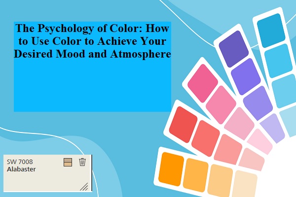
Color can have a significant impact on your mood and the atmosphere of your living space. When selecting colors for your home, it’s essential to consider the psychology behind color selection.
Warm Colors
Warm colors, such as red, orange, and yellow, can create a cozy and inviting atmosphere in your home. They can also stimulate conversation and activity, making them an excellent choice for social areas such as living rooms and dining rooms.
Cool Colors
Cool colors, such as blue, green, and purple, can create a calm and serene atmosphere in your home. They’re often associated with relaxation and tranquility, making them an excellent choice for bedrooms and bathrooms.
Neutral Colors
Neutral colors, such as Alabaster, can create a timeless and sophisticated look in your home. They provide a neutral backdrop for other colors and textures in your living space, allowing you to switch up your decor seasonally or as your tastes change over time.
Conclusion
Alabaster color is a trendy and stylish paint shade that has become very popular in the design world. It can be used to paint walls and cabinets, or as an accent color and looks great when paired with various coordinating colors and design styles.
When choosing colors for your home, it is important to think about the psychology behind color selection and how it can affect your mood and the atmosphere of your living space. By using color strategically, you can create a beautiful and functional home.
Sherwin Williams Alabaster 7008 is a timeless paint color that can add warmth and sophistication to any living space. Its subtle undertones of beige and gray make it a versatile shade that pairs well with various coordinating colors and design styles.
To create a cohesive and harmonious look throughout your living space, it’s important to consider the undertones of the paint shade when selecting coordinating colors for Alabaster.